Title Design
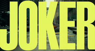
We will be using the Broadway font in our opening scene as it goes with our theme of a futuristic sci-fi look. It looks something like this. We will be using the colors green and black with a sort of glowing effect for our titles throughout the opening scene depending on whether the background is lighter or darker at certain parts. This will set the mood of the beginning of the movie giving off futuristic and mysterious vibes. The size of the font will be big enough to fill most of the screen but not too big that it will completely cover what is going on behind. The purpose is to show the audience who were involved in the making of our film without drawing too much attention away from what is going on behind. Our working title is Hide and Seek although it may change in the future. The titles will enter and leave the screen through simple animations that also add to the strangeness and mystery of the opening scene. Each title will be on screen for around 3 seconds to give the audience enough time to read it but also save time for more important parts of our film
.png)


Comments
Post a Comment